
Patrick Spedding (Author's Website)
Patrick Spedding is Senior Director of BI R&D for Rocket Software, and IBM Champion for IBM Collaboration Solutions. He is also a Non-Executive Director on the Board of Eastside Radio in Sydney, Australia. Prior roles include Director of Product Management for IBM Cognos, Director of Field Marketing for Cognos, Founder of Tableau partner See-Change Solutions, and SAS Solution Manager for BI and Strategy Management. Patrick's qualifications include an MBA degree in Marketing (AIU), Diploma in Management (University of Michigan), BSc (Hons) in Mathematics (Loughborough University, UK), Fellow of the Australian Institute of Management (FAIM), and member of the Australian Institute of Company Directors (AICD).
Find Patrick on Google+
Connecting Tableau to SAS Datasets via the SAS OLE DB Provider
One of the topics which generated a lot of interest during my presentation on SAS/Tableau Integration at the recent ‘TCC13’ Tableau Conference, was the idea of connecting to SAS datasets via the SAS OLE-DB Provider. While SAS themselves refused to allow such a presentation at their own customer conference…, it was unexpected as much as rewarding to find an audience of around 150 people at a Tableau conference interested in SAS connectivity!
Currently, Tibco Spotfire is the only 3rd party Data Discovery tool I’m aware of, which natively supports OLE-DB connectivity to SAS datasets. The benefit of OLE-DB is that it does not require access to SAS Server in order to connect to a SAS dataset. This is important, because often SAS datasets are stored locally or on a network share. SAS ODBC requires SAS Server connectivity, which in turn requires SAS client/server connectivity (eg SAS Integration Technologies)
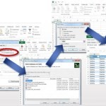
A workaround is to connect to SAS datasets via OLE-DB using Excel as a ‘gateway’. Since the OLE-DB connection definition dialog is fully exposed within Excel, the connection details to the SAS dataset can be set up and tested. Then Tableau can be pointed to the Excel file, through which the SAS data can be retrieved.
Since the OLE-DB connection provides a way to automate the refresh of the SAS data from within Excel, this method can help ensure that the Tableau workbook is kept up-to-date as the underlying SAS data changes.
To follow are the steps to set up the Ole-DB connectivity.
When the Tableau workbook is saved, the SAS data can be refreshed by periodic refresh of the Excel connection. This can be scheduled to ensure that Tableau is retrieving the most up-to-date information from SAS.
Here is a video demonstrating the process described above (sorry, no audio):
Editorial: Economic Growth in this new ‘Digital Century’
I was recently asked to write an Editorial piece for the bi-monthly ‘Agenda’ magazine published by Gosford Business Chamber. The article is reproduced below, with a link to ‘Agenda’ magazine.
Link to Gosford Business Chamber ‘Agenda’ magazine – online edition
ECONOMIC GROWTH IN THIS NEW ‘DIGITAL CENTURY’
DATA WILL BE A KEY DRIVER OF GLOBAL ECONOMIC GROWTH IN THIS NEW ‘DIGITAL CENTURY’. THIS DIGITAL ECONOMY WILL HAVE A PROFOUND EFFECT ON ALL ASPECTS OF SOCIETY – BUSINESS, EDUCATION, HEALTH CARE, FINANCE AND GOVERNMENT
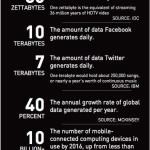
| Every day, 2.5 quintillion bytes of data is created – in fact, 90% of the data in the world today has been created in the last two years alone.This data comes from everywhere: social media sites, online purchase transactions, mobile phone GPS signals, and so on. This data is known as ‘Big Data’. Visit https://www.couchbase.com/products/mobile to learn more about this.
For small businesses and consumers, this ‘big data revolution’ promises a wide range of benefits. Big data will improve our communities, help us make better decisions and create a wide range of new business opportunities. It is estimated that global online traffic will quadruple by 2015 as the number of gadgets linked to the internet climbs to 15 billion, according to a forecast by Cisco. Over the next decade, analysts expect the global volume of digital data to increase more than 40-fold. From a Central Coast perspective, the opportunity now exists to establish some quick wins from the NBN Rollout, driving economic prosperity for the region. In the US for example, communities are already leveraging these new fibre-optic capabilities to drive innovation and grow their economies. There is no reason that Gosford cannot do likewise, and become the Central Coast’s own ‘Gigabit City’. |
The digital economy removes the ‘tyranny of distance’, helping to level the playing field – particularly for small businesses in regions such as the Central Coast. |

A/NZ BI Trends – Visualisation, Mobility and Self-Service
As part of several breakfast briefings I ran in 2011-12 on the topic of Visualisation, Mobility (Mobile BI) and Self-Service Reporting, I asked all participants a number of questions relating to their own internal BI/Reporting environments. This ran in conjunction with an email based survey, which received a very good (7%) response rate. Covering all industries and geographies across A/NZ, I received 230 responses in total. What became clear from the results was that BI, although assumed to be mature and pervasive, had not solved the Reporting problem in most organisations.
Here is a summary of the survey results, in Slide format.
We certainly need to heed the message of frustrated users, and focus on empowering the Knowledge Workers to solve complex business problems. Intuitively. And fast.
For anyone interested in my full survey results report, I can be contacted via email.
Reporting on ‘% of base’ in Cognos10
A workaround for the lack of ‘% of base’ functionality in Business Insight Advanced
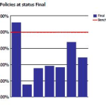
A common requirement is to be able to product % of total or ‘% of portfolio’ reports, for comparative analysis. Unfortunately, this capability is currently missing in Business Insight Advanced. A workaround exists, which is to use the ‘% of’ calculation provided in Business Insight Advanced to hard-code the total value. However this introduces excessive report maintenance implications.
An alternative approach is to use Analysis Studio, which does support % of base, to ‘author’ the basic report layout required, then finish the report in Business Insight Advanced. (Note, however, that it is currently not possible to open an Analysis Studio view in Business Insight Advanced – it is necessary to open the view in Report Studio first, save to Cognos Connection, from where it can then be opened in Business Insight Advanced)
Example
In the following example, we are looking to create a sectioned report, showing % of total for each column in the report. Starting in Analysis Studio, we have a crosstab like this:

Since Analysis Studio does not report ‘Section’ functionality (as is available in Query Studio, Report Studio and BIA), this will have to be added later.
The first step in Analysis Studio will be to add the desired measure as a nested level within the crosstab view (this will simplify creation of the % calculations later):

Next, the ‘% of total’ calculation will be added:

Next, an additional dimension will be added, which will form the rows of each section in the final report:

This view can now opened directly into Report Studio, or saved to Cognos Connection:

From Report Studio, the report can now be saved back to Cognos Connection (under a new name), which will finally enable it to be opened in Business Insight Advanced:

(Note: it is hoped that Cognos will improve the inter-Studio workflow in future versions, to enable Analysis Studio view to be opened directly into Business Insight Advanced, either from within Analysis Studio or from Cognos Connection)
This view can now opened directly into Report Studio, or saved to Cognos Connection:

Note the automatic creation of subtotals for rows and columns:

In the context of report sections, this is entirely unnecessary. However, currently within BIA there is no easy way to add/remove nested subtotals. After manually cutting out each of the superfluous totals, and sectioning the report (using the Section/Unsection button), we end up with the required report layout:

Summary
It had been hoped that Cognos 10 would introduce some level of Studio ‘rationalization’ in order to simplify the workflow for Business Analysts in particular. Unfortunately, the introduction of Business Insight Advanced (BIA) and Business Insight has thus far only added 2 new Studios without rendering any of the existing Studios redundant. It is to be hoped that in future versions, it will be less necessary to jump around several Cognos interfaces in order to construct what are relatively simply reports.
Footnote: It turns out this is trivially easy to do in Tableau (around 9 mouse clicks) and, ironically, in PowerPlay Client (5 mouse clicks).
Setting up SAS dates for input into Tableau Desktop
Some techniques for setting up integration between the SAS and Tableau solutions, specifically with respect to date formats.
SAS and Tableau are ‘best of breed’ in their own areas – SAS in the area of Analytics and ‘Analytical Data Preparation’, Tableau in the area of data visualization and interactive dashboarding in an intuitive, drag & drop environment. Consequently, it makes sense to find ways to integrate these technologies to provide an Integrated Information Framework which leverages the strengths of both solutions.
Leveraging SAS capabilities in this way provides a way to ‘rapid prototype’ business reporting requirements, without the costs and delays typically seen when attempting to model emerging business requirements in the Data Warehouse via traditional ETL methods.
In addition, this approach suggests a way to protect the investment in analytical reporting as developed by the SAS team, by providing a platform to publish those reports for easy consumption, plus easy re-formatting and ‘slice & dice’ of these reports in the Tableau environment
Example
Typically, the easiest way to prepare SAS data for consumption in Tableau is to set up an export process in SAS Enterprise Guide:

Using the SAS Enterprise Guide Export wizard, a SAS dataset can be exported as CSV, as a step in the process. Dataset is exported to a network location. SAS process looks like this, and can be set up to run on a schedule eg monthly.
In this example, we have a number of dates in our SAS dataset:

Often, the default date format as set up in SAS is adequate to be imported into, and correctly interpreted by, Tableau.
Where this is not the case, the SAS date format ‘DDMMYYS8.’ can be used:

Which would produce SAS code similar to the following:
PROC SQL;
CREATE TABLE WORK.QUERY_FOR_POLICY1 AS
SELECT t1.trandate FORMAT=DDMMYYS8.,
t1.polexpdt FORMAT=DDMMYYS8.,
t1.commdate FORMAT=DDMMYYS8.
FROM WORK.QUERY_FOR_POLICY t1
QUIT;
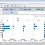
On importing the dataset into Tableau, the dates are correctly interpreted, automatically providing the ability to drill from Year to Quarter to Month:

Note: While it is generally easier to prepare the data in the most appropriate format for Tableau using the extensive SAS’ data functions and formatting options, there are also date functions within Tableau. For example, to convert a text (string) field containing dates in the format YYYYMMDD into a date within Tableau, the following could be set up as a calculated field:
Date(right([PERIOD],2) + “/” + mid([PERIOD],5,2) + “/” + left([PERIOD],4))
Summary
In addition to the approach described above, another way to ‘prepare’ SAS data for consumption in Tableau involves using the SAS ‘PROC SQL’ method to output SAS results directly to a relational table. With the SAS/ACCESS interface, database objects can be referenced directly in a DATA step or SAS procedure using the SAS LIBNAME statement. PROC SQL can be used to update, delete or insert data into a relational table, for example via Bulk Load.

Cognos OLAP: Understanding performance differences
 This weekend, I was reading a very interesting discussion on LinkedIn, on the topic of OLAP (specifically Cognos OLAP). On this thread, ex-Cognoid Norman Bobo does an excellent job of describing the differences between Cognos PowerCubes and TM1.
In his comments, Norman describes in detail several differences between the two technologies. Here is a summary of his key points:
1) Purposes – PowerCubes are a read-only BI solution – TM1 is read/write
2) Dates – PowerCubes have the concept of date dimensions – TM1 does not
3) Levels – PowerCubes have the concept of dimension levels – TM1 does not
4) Attributes – TM1 has strong support for attributes – PowerCubes do not
5) Cube building – very different (TM1 is an in-memory solution, PowerCubes are not)
6) Data Scalability – PowerCubes do not manage large dimensions very well
7) User Scalability – TM1 is not so easily scaled
8) Cognos BI Integration – as a legacy Cognos technology, PowerCubes are more tightly integrated
(I strongly encourage you read the entire thread here)
From a User Experience perspective, I believe IBM would position their various offerings as specialized OLAP approaches to optimize for specific types of applications:
In truth, each solution does has it’s own unique strengths and weaknesses:

It is also interesting to consider how each solution approaches roll ups and aggregation. Specifically:
PowerCube – data structures are pre-aggregated:
TM1 OLAP – sources aggregate on the fly:
Cubing Services – optimizes the most common paths or caches as you go:
So, which is best for Read-only BI? Well, of course it depends on the customer requirements. As Norman points out in his article, data volumes and user volumes are key considerations. Some general guidelines are as follows:

It is certainly important to be aware of the frequency & type of reporting required by the user community, as well as the size and geographic location of the user community (e.g. centralised or decentralised). It also worth noting that Cognos internal testing clearly demonstrated that Powercubes scaled very well with increasing concurrent user volumes, whereas TM1 cubes did not.
Other points of note:
Key takeaways….
Footnote:
Interestingly, many years ago I actually built a neural network model (using Cognos 4Thought) of PowerCube build statistics from Cognos customers around the world, in order to identify the factors which had the biggest impact on Cube build times.
The neural network model clearly demonstrated the strong correlation between cube build times and the number of categories in the PowerCube.

Lies, Damn Lies and Statistics…
I recently read an interesting article in the Sydney Morning Herald, entitled “Workaholics prefer Potts Point, but it’s go slow at the beach”. The very first paragraph by the author, (@MAttWadeSMH), makes the rather bold statement:
“The densely populated harbourside neighbourhood of Potts Point has emerged as Sydney’s hardest working suburb”.
This assertion was made on the basis of the recently released Australian Bureau of Statistics Census data for 2011.
Now, a very good friend, Richard Hoptroff, once made the comment: “If you torture the data long enough, it will tell you what you want to hear”. So I wonder if, in this particular case, the headline (a good one, admittedly) wrote itself and the Census data was then scoured for supporting evidence? Rather than, say, finding a way of letting the data tell it’s own story, free from what Bazerman would call “judgemental bias” (Bazerman, M.H. and Moore, D.A. (2008), Judgment in Managerial Decision Making, 7th ed. New York: Wiley.)
To support the story, several beach communities were used by way of contrast to “hard working” Potts Point(“..Pearl Beach workers only clocked up 29.4 hours”). So, I thought it would be interesting to put the data (freely available from http://abs.gov.au/census) into a Data Visualization tool (Tableau) and see what emerged..
Immediately, it became obvious that large demographic differences were driving differences in median hours worked per week by suburb, not work ethic. For example, the communities called out for “only clocking up” less than 30 work hours per week, are made up of a significant proportion of retirees (Pearl Beach has 29% over 65, Kincumber South 31%, Potts Point only 6%. The median age in Kincumber South is 64, in Pearl Beach it is 62, in Potts Point, 35). So including those no longer working in a calculation of average working hours for a community is clearly flawed analysis (I’m sure those in the retirement communities of Kincumber South would argue they’ve worked hard enough for many years!!)
Similarly, Haymarket, another suburb called out in the “hall of shame” (ie in the Bottom 3 suburbs for average hours worked), has 31% aged between 15-24, with a median age of only 27. Now, with University of Technology Sydney and the University of Sydney within walking distance, I suspect this indicates these are university students (some may take offence to the notion that getting a degree is not “hard work”…).
Close to the “go slow” beach communities of Pearl Beach and Kincumber South, but at the other end of the spectrum in terms of demographic, are the communities of Erina Heights and Doyalson, both with 25% of their communities under 15 (compared to Potts Point which has 3% under 15). On the eve of National Teleworking Week, I wonder if we should instead be applauding those communities for striving for some level of work-life balance? (unless, of couse, @MAttWadeSMH has included children in his calculation of average hours worked..)
So, we can see that a suburb applauded for it’s work ethic, but with the majority of the population of working age, is very different to a suburb with most of the population over 65 or under 15. Visualizing the data helps us to see the real story behind the numbers.
Addendum:
It’s not just the age demographic which is significantly different between the Central Coast and the likes of Potts Point, Milsons Point etc. Ethnicity by suburb also varies drastically, as shown by the following visualization:
Visualizing Council Elections
Recently, we had our Local Government (Council) Elections. Presented with an overwhelming list of candidates I knew nothing about, I endeavoured to make sense of what little information was available. To find the story behind the data..
My hypothesis was as follows. Under the assumption that candidates living far from my small town would not have our local issues top of mind should they get elected, I calculated the distance each candidate lived, let’s call it proximity. I also decided that candidates who were still students (there were several) would not have the necessary experience to be guiding council policy and making informed decisions on local issues ie to be an effective councillor. Then, using Tableau, I prepared the following views of candidates, ranked by proximity to Copa, and colour-coded based on their age (estimated):
Truth be told, most people simply vote ‘above the line’ for one political party or other, but having voted based on the information gleaned through my data visualization, I at least felt virtuous in the knowledge that I’d put a little thought into the process. And learned about the power of data visualization in doing so.
Dude, where’s my laptop?
So this is the first overseas trip in recent memory where I do not have a laptop with me. It feels strange. You might say, a bit of a gamble…

It doesn’t seem so long ago that “Mobile BI” was realistically BI running on a laptop, and the early attempts at BI on smartphones really little more than a gimmick. Security was typically the first objection raised (either “I don’t want corporate data stored on a mobile device” or “I don’t want my corporate data stored offshore” eg Canada…).
Adoption rates of mobile devices is far outpacing previously observed adoption rates of Internet or desktop-based technologies. In fact, Gartner predicts 1/3 of BI content will be consumed on mobile devices by 2013.
So why the rapid adoption? First, and perhaps most importantly, the increased ‘form factor’. Smart phones were really too small for interfaces of much sophistication, but with the advent of the iPad and other tablet devices, we now have an interface large enough for “real” applications. Secondly, improvements made around security like secure critical infrastructure systems (more if this in a moment). Add in the potential for improved productivity (faster time to decisions, end-user self-service) and we are finally starting to see the “democratization” (is that a word?) of BI.
One critical area for BI vendors to get right right is the UI itself. My 4 year old son is already a proficient iPad user, and if an iPad App doesn’t work the way he expects (ie natively, supporting gestures like pinch and zoom), then he exits out in disgust and declares “It’s broken!”. So treating mobile devices like “just another interface” or ‘supporting’ mobile devices via the browser rather than a native App has the potential to create user dissatisfaction. As Lalitha Chikkatur recently wrote: “The important thing to remember… is that mobile BI is not just a mobile version of traditional BI; it is a mistake to overlook the unique considerations required for implementation.’’ (“10 Mistakes to Avoid in Mobile BI Delivery”, Information Management).
A key challenge in the past has been security. Now, mobile device vendors are starting to address these concerns which is reducing the barriers to adoption from corporate IT. Seven device policies are currently supported:
1. Require email session encryption.
2. Wipe devices if they are lost or stolen.
3. Protect devices with a passcode lock.
4. Autolock devices after periods of inactivity.
5. Autowipe devices after failed unlock attempts.
6. Protect the configuration profile.
7. Continuously refresh policies.
With Enterprise Security improved, reduced cost (compared to, for example, laptops), improved/unlimited data plans (in some countries at least..), improved form factor enabling business applicability, it is easy to see why analysts are predicting such a huge uptake in Mobile BI over the next few years:
“Forrester predicts that this future generation of mobile devices will eclipse the use of traditional laptops for mobile BI applications within three to five years”
(Boris Evelson – A Practical How-To Approach To Mobile BI, March 2011)

Here in the US, I’m finding that WIFI is available, for free, in many places eg malls, shops, hotels – thus enabling me to avoid the need to activate my iPad SIM (and incur very expensive Australian data roaming charges).
Now, With VPN, secure ‘Cloud’ data solutions like Dropbox and iDisk, Office-compatible and other related business Apps on my iPad (including Roambi ES for SAS!!), I hope to find that I’m not missing my laptop too much. Let’s see how that goes…
Update:
Here are some things that I’ve noticed after a week or so with only my iPad and iPhone….
- WIFI is not always reliable. While some may advocate a WIFI-only infrastructure strategy as ‘good enough’, I have found it at times frustrating to not be able to ‘plug in’ to broadband via Ethernet (wired) where available. In fact, in some hotels wired Ethernet is the only option (Tip: travel with a small wireless router such as the Apple Airport Express for such situations)
- No ability to save-as or print to PDF eg for saving online invoices, confirmations, sharing reports etc
- No access to Flash-based web apps or online Flash content. While this may become less of an issue as HTML5 matures, for right now it’s an inconvenience.
- Spreadsheet functionality is limited: I have a spreadsheet App installed on my iPad, but it does not offer full spreadsheet functionality. With spreadsheet use still so prevalent within organisations, I could see such limitations being an issue for some business users. In fact, In my recent survey of over 200 Australian managers and executives, I found that 90% still use spreadsheets for their reporting needs. This may be somewhat due to limitations with traditional BI solutions; newer BI capabilities such as SAS Add-in for Microsoft Office (AMO) now offer much tighter integration with Office components such as Excel, so I would expect to see this rate reduce over time.
Overall, I have found that I’ve missed my laptop for some of the reasons above. This leads me to wonder whether the estimates of Gartner/Forrester and others predicting such high adoption of BI on mobile devices within relatively short timeframes to be perhaps optimistic? While this could be possible in countries with extensive (free) WIFI for mobile business users, in other countries where WIFI connectivity is patchy or expensive, it may be that Mobile BI adoption could be somewhat slower.
A/NZ Business Intelligence Survey
Recently, I attended the announcement of the Longhaus Pulse Research on BI and Analytics for 2011. Longhaus Pulse is the most comprehensive and regionally focused assessment of the Business Intelligence and Analytics market in Australia.
One area I found interesting was Longhaus Managing Director Peter Carr‘s observations around the evolution of the Business Intelligence market. Having worked in the BI industry for almost 20 years, this is something I can definitely relate to. Peter compared the current exciting trends around “Next Generation BI” to the prevalent trends of the 1980’s, 1990’s and 2000’s. Right now, Peter observed, trends around “Cloud” and Social Media are “putting the power back into the hands of the knowledge workers”. It’s certainly interesting that the “Next Generation BI” trends are all around Data Visualization, End User Self-Service, and Mobility (Mobile access to information). In other words, empowering the business user. (Funny, I thought we already had that in the 90’s…). Unfortunately, the 2000s became about “BI Standardization”, Portals and the like which were all heavily IT-centric. In the process, BI vendors perhaps lost sight of what BI was all about. Enabling users to get access to the Right Information, at the Right Time, to make Better Decisions. Longhaus talk about the “Digital Divide”, with BI technology outpacing end-user capability/need (just how many ‘Studios’ do I actually need to get access to my information???)
The consequence? Spreadsheets. And more spreadsheets. Spreadsheets everywhere.
The problem with this? Disparate data silos. Poor data integrity. Lack of an audit trail. Lost productivity. Inability to make timely, fact-based decisions.
Which brings me to my recent survey of BI trends in A/NZ. Covering all industries and geographies across A/NZ, I received 230 responses (7% response rate). What became clear from the results was that BI, although assumed to be mature and pervasive, had not solved the Reporting problem in most organisations. For example:
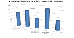
- Disparate Systems and Poor Data Quality are still views as the biggest challenged faced when relying on data to drive performance.
- 90% of respondents state that spreadsheets are still being used as part of the query & reporting process
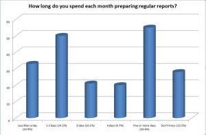
- More than 1 in 4 spend 5 or more days each month preparing regular reports (ie one week of every month)
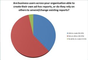
- Over 60% rely on others or have no ability to create their own ad-hoc reports
Most surprising of all, 40% are currently evaluating (or re-evaluating) their BI vendors, with a further 26% planning to do so within the next 12 months.
We need to heed the message of frustrated users, and focus on empowering the Knowledge Workers to solve complex business problems. Intuitively. And fast.
For anyone interested in my full survey results report, I can be contacted via email.



Connect
Connect with us on the following social media platforms.