
Category: Data Visualization

Lessons on data analytics from a tween
I recently received a note from my 11 year old son’s maths tutor, which read:
“Jack will be covering Data, specifically: collecting categorical and numerical data thru observations and surveys, Constructing data displays including dot plots, column graphs and line graphs, naming and labelling vertical and horizontal axes, Using scale to determine placement of each point when drawing a line graph.”
“Aha! Welcome to the world of Business Intelligence!” I thought with a smile. Excitedly, I introduced Jack to my veritable library of books on the subject of charting and data visualization, including of course, all my favourites such as “Signal: Understanding What Matters in a World of Noise” by Stephen Few, “The Wall Street Guide to Information Graphics (the do’s and don’ts of presenting data, facts and figures)”, “Data Points: Visualization That Means Something” and many others. With no words and a tweenage look of disdain, he resumed his game of Roblox (Minecraft was no longer “cool” since it’s acquisition by Microsoft, I was off-handedly informed…)
Then, almost in passing, Jack mused: “I wonder how the number of Roblox users by year would look in a line chart…?”
Challenge accepted. A quick Google search, drop the data into a self-service data visualization tool, and we had our answer.

What was quite interesting to me was that he was thinking in terms of the data, wanting to answer a question empirically, and wanting to see the data visually to interpret the results. Now, as I listen to my son in the background, collaborating in real-time with one of his school friends in multi-player Roblox while they chat and interact simultaneously through Facetime, it’s occurs to me that future generations of ‘knowledge worker’ are likely to be much more collaborative and team-oriented, much more visual and data savvy, much less inclined to accept decision-making which cannot be supported by data. Which, of course, reminds me of a classic Dilbert moment:

Couple the inquisitive, knowledge-hungry mindset of our younger generations with the relentless pace of change and innovation, and we can anticipate that our future business users will not be tolerant of poor decision-making or slow time to action caused by the outdated insights provided by traditional analytics infrastructures. Today more than ever, analytics is a key to business success, but it needs simplicity, real-time speed and security: how fast can a user access and blend all the disparate data they need, analyze and share it, then take action, all in a secure and controlled environment? How can we provide solutions which enrich data with context, to build consensus? How can we empowering teams with the right data, providing machine learning-driven insights and personalization? Cognitive, collaborative analytics helps teams take action in real-time, to work on the right things at the right time. Our future decision-makers will expect nothing less.
Footnote – 10 of my favourite books on Data Visualization and Presentation:
- Signal: Understanding What Matters in a World of Noise – Stephen Few
- Now You See It: Simple Visualization Techniques for Quantitative Analysis – Stephen Few
- Data Points: Visualization That Means Something – Nathan Yau
- Presentation Zen: Simple Ideas on Presentation Design and Delivery – Garr Reynolds
- The Wall Street Journal Guide to Information Graphics: The Dos and Don’ts of Presenting Data, Facts, and Figures – Dona M. Wong
- Design for Information: An Introduction to the Histories, Theories, and Best Practices Behind Effective Information Visualizations – Isabel Meirelles
- Visualize This: The FlowingData Guide to Design, Visualization, and Statistics – Nathan Yau
- The Visual Display of Quantitative Information – Edward R. Tufte
- Show Me the Numbers: Designing Tables and Graphs to Enlighten – Stephen Few
- Storytelling with Data: A Data Visualization Guide for Business Professionals – Cole Nussbaumer Knaflic

Connecting Tableau to SAS Datasets via the SAS OLE DB Provider
One of the topics which generated a lot of interest during my presentation on SAS/Tableau Integration at the recent ‘TCC13’ Tableau Conference, was the idea of connecting to SAS datasets via the SAS OLE-DB Provider. While SAS themselves refused to allow such a presentation at their own customer conference…, it was unexpected as much as rewarding to find an audience of around 150 people at a Tableau conference interested in SAS connectivity!
Currently, Tibco Spotfire is the only 3rd party Data Discovery tool I’m aware of, which natively supports OLE-DB connectivity to SAS datasets. The benefit of OLE-DB is that it does not require access to SAS Server in order to connect to a SAS dataset. This is important, because often SAS datasets are stored locally or on a network share. SAS ODBC requires SAS Server connectivity, which in turn requires SAS client/server connectivity (eg SAS Integration Technologies)
A workaround is to connect to SAS datasets via OLE-DB using Excel as a ‘gateway’. Since the OLE-DB connection definition dialog is fully exposed within Excel, the connection details to the SAS dataset can be set up and tested. Then Tableau can be pointed to the Excel file, through which the SAS data can be retrieved.
Since the OLE-DB connection provides a way to automate the refresh of the SAS data from within Excel, this method can help ensure that the Tableau workbook is kept up-to-date as the underlying SAS data changes.
To follow are the steps to set up the Ole-DB connectivity.
|
Step 1: Define OLE-DB connection within Excel Open up a blank Excel workbook. Under the ‘Data’ menu, select the option ‘From Other Sources’ then select ‘From Data Connection Wizard’: |
 |
|
Step 2: Select the Base SAS Data Provider In the Data Connection Wizard, select ‘Other/Advanced’ then click Next: |
 |
| Select the SAS OLE-DB Provider (9.2 or 9.3 as appropriate): |
 |
|
Step 3: Define Connection Properties The next step is perhaps the least intuitive. The ‘Data Link Properties’ dialog requires a connection to be defined to the SAS data set. For this to work correctly, all that is needed is the path to the folder where the SAS datasets reside. This is entered into the ‘Data Source’ property. The other options such as ‘Location’ and ‘User name’ can be ignored. Test the connection, then click OK. |
 |
| Step 4: Select the desired SAS dataset to connect to |

|
| Step 5: Save the Data Connection |
 |
| Step 6: Import the data |
Verify that the OLE-DB is working as expected by importing the SAS dataset into Excel via the OLE-DB Provider connection which has just been defined: |
| Step 7: Save the Excel spreadsheet containing the SAS OLE-DB Connection |
 |
| Step 8: In Tableau, Connect to the Excel File |
Select ‘Connect to Data’, then select ‘Microsoft Excel’. Select ‘ Live Connection’. |
When the Tableau workbook is saved, the SAS data can be refreshed by periodic refresh of the Excel connection. This can be scheduled to ensure that Tableau is retrieving the most up-to-date information from SAS.
Here is a video demonstrating the process described above (sorry, no audio):

Setting up SAS dates for input into Tableau Desktop
Some techniques for setting up integration between the SAS and Tableau solutions, specifically with respect to date formats.
SAS and Tableau are ‘best of breed’ in their own areas – SAS in the area of Analytics and ‘Analytical Data Preparation’, Tableau in the area of data visualization and interactive dashboarding in an intuitive, drag & drop environment. Consequently, it makes sense to find ways to integrate these technologies to provide an Integrated Information Framework which leverages the strengths of both solutions.
Leveraging SAS capabilities in this way provides a way to ‘rapid prototype’ business reporting requirements, without the costs and delays typically seen when attempting to model emerging business requirements in the Data Warehouse via traditional ETL methods.
In addition, this approach suggests a way to protect the investment in analytical reporting as developed by the SAS team, by providing a platform to publish those reports for easy consumption, plus easy re-formatting and ‘slice & dice’ of these reports in the Tableau environment
Example
Typically, the easiest way to prepare SAS data for consumption in Tableau is to set up an export process in SAS Enterprise Guide:

Using the SAS Enterprise Guide Export wizard, a SAS dataset can be exported as CSV, as a step in the process. Dataset is exported to a network location. SAS process looks like this, and can be set up to run on a schedule eg monthly.
In this example, we have a number of dates in our SAS dataset:

Often, the default date format as set up in SAS is adequate to be imported into, and correctly interpreted by, Tableau.
Where this is not the case, the SAS date format ‘DDMMYYS8.’ can be used:

Which would produce SAS code similar to the following:
PROC SQL;
CREATE TABLE WORK.QUERY_FOR_POLICY1 AS
SELECT t1.trandate FORMAT=DDMMYYS8.,
t1.polexpdt FORMAT=DDMMYYS8.,
t1.commdate FORMAT=DDMMYYS8.
FROM WORK.QUERY_FOR_POLICY t1
QUIT;
On importing the dataset into Tableau, the dates are correctly interpreted, automatically providing the ability to drill from Year to Quarter to Month:

Note: While it is generally easier to prepare the data in the most appropriate format for Tableau using the extensive SAS’ data functions and formatting options, there are also date functions within Tableau. For example, to convert a text (string) field containing dates in the format YYYYMMDD into a date within Tableau, the following could be set up as a calculated field:
Date(right([PERIOD],2) + “/” + mid([PERIOD],5,2) + “/” + left([PERIOD],4))
Summary
In addition to the approach described above, another way to ‘prepare’ SAS data for consumption in Tableau involves using the SAS ‘PROC SQL’ method to output SAS results directly to a relational table. With the SAS/ACCESS interface, database objects can be referenced directly in a DATA step or SAS procedure using the SAS LIBNAME statement. PROC SQL can be used to update, delete or insert data into a relational table, for example via Bulk Load.

Lies, Damn Lies and Statistics…
I recently read an interesting article in the Sydney Morning Herald, entitled “Workaholics prefer Potts Point, but it’s go slow at the beach”. The very first paragraph by the author, (@MAttWadeSMH), makes the rather bold statement:
“The densely populated harbourside neighbourhood of Potts Point has emerged as Sydney’s hardest working suburb”.
This assertion was made on the basis of the recently released Australian Bureau of Statistics Census data for 2011.
Now, a very good friend, Richard Hoptroff, once made the comment: “If you torture the data long enough, it will tell you what you want to hear”. So I wonder if, in this particular case, the headline (a good one, admittedly) wrote itself and the Census data was then scoured for supporting evidence? Rather than, say, finding a way of letting the data tell it’s own story, free from what Bazerman would call “judgemental bias” (Bazerman, M.H. and Moore, D.A. (2008), Judgment in Managerial Decision Making, 7th ed. New York: Wiley.)
To support the story, several beach communities were used by way of contrast to “hard working” Potts Point(“..Pearl Beach workers only clocked up 29.4 hours”). So, I thought it would be interesting to put the data (freely available from http://abs.gov.au/census) into a Data Visualization tool (Tableau) and see what emerged..
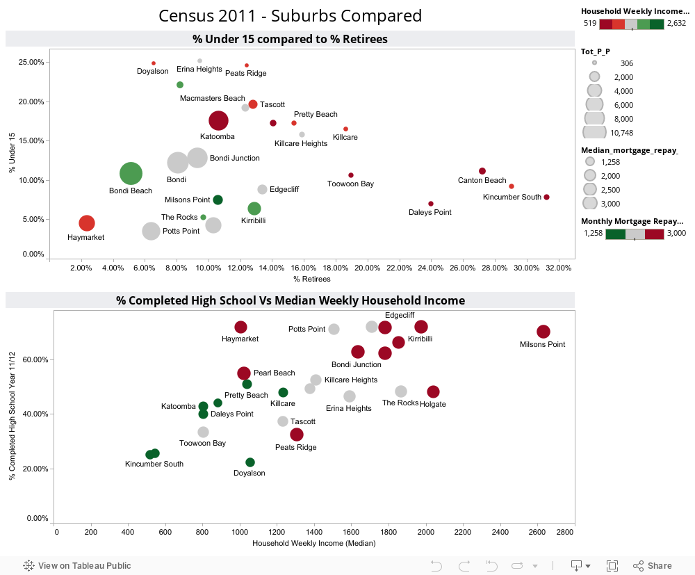
Immediately, it became obvious that large demographic differences were driving differences in median hours worked per week by suburb, not work ethic. For example, the communities called out for “only clocking up” less than 30 work hours per week, are made up of a significant proportion of retirees (Pearl Beach has 29% over 65, Kincumber South 31%, Potts Point only 6%. The median age in Kincumber South is 64, in Pearl Beach it is 62, in Potts Point, 35). So including those no longer working in a calculation of average working hours for a community is clearly flawed analysis (I’m sure those in the retirement communities of Kincumber South would argue they’ve worked hard enough for many years!!)
Similarly, Haymarket, another suburb called out in the “hall of shame” (ie in the Bottom 3 suburbs for average hours worked), has 31% aged between 15-24, with a median age of only 27. Now, with University of Technology Sydney and the University of Sydney within walking distance, I suspect this indicates these are university students (some may take offence to the notion that getting a degree is not “hard work”…).
Close to the “go slow” beach communities of Pearl Beach and Kincumber South, but at the other end of the spectrum in terms of demographic, are the communities of Erina Heights and Doyalson, both with 25% of their communities under 15 (compared to Potts Point which has 3% under 15). On the eve of National Teleworking Week, I wonder if we should instead be applauding those communities for striving for some level of work-life balance? (unless, of couse, @MAttWadeSMH has included children in his calculation of average hours worked..)
So, we can see that a suburb applauded for it’s work ethic, but with the majority of the population of working age, is very different to a suburb with most of the population over 65 or under 15. Visualizing the data helps us to see the real story behind the numbers.
Addendum:
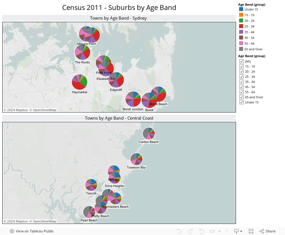
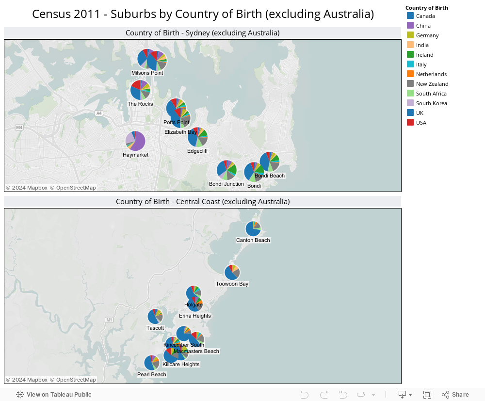
It’s not just the age demographic which is significantly different between the Central Coast and the likes of Potts Point, Milsons Point etc. Ethnicity by suburb also varies drastically, as shown by the following visualization:
Visualizing Council Elections
Recently, we had our Local Government (Council) Elections. Presented with an overwhelming list of candidates I knew nothing about, I endeavoured to make sense of what little information was available. To find the story behind the data..
My hypothesis was as follows. Under the assumption that candidates living far from my small town would not have our local issues top of mind should they get elected, I calculated the distance each candidate lived, let’s call it proximity. I also decided that candidates who were still students (there were several) would not have the necessary experience to be guiding council policy and making informed decisions on local issues ie to be an effective councillor. Then, using Tableau, I prepared the following views of candidates, ranked by proximity to Copa, and colour-coded based on their age (estimated):

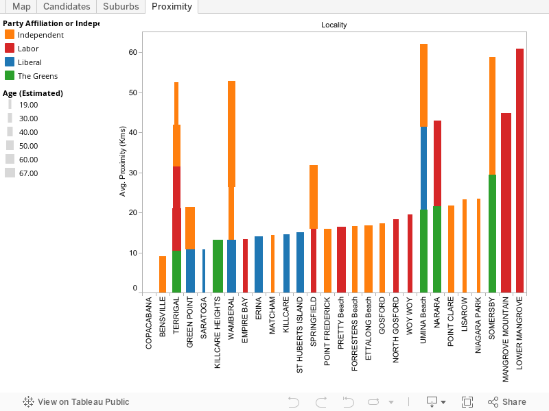

Truth be told, most people simply vote ‘above the line’ for one political party or other, but having voted based on the information gleaned through my data visualization, I at least felt virtuous in the knowledge that I’d put a little thought into the process. And learned about the power of data visualization in doing so.
Connect
Connect with us on the following social media platforms.